
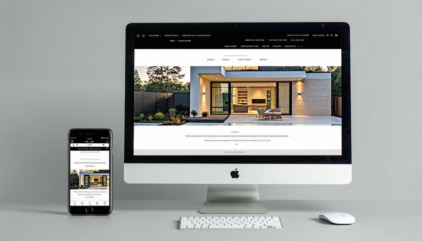
Discover how a mobile-first website design can transform your digital presence and boost your business's success.
Enhanced User Experience Across All Devices
A mobile-first design ensures that your website is optimized for smaller screens before scaling up to larger ones. This approach guarantees that users on smartphones and tablets have a smooth and enjoyable experience. By focusing on mobile users first, you create a site that is both accessible and user-friendly, making it easier for visitors to navigate and engage with your content.
Furthermore, a mobile-first design often results in faster load times and more straightforward navigation, which are crucial for keeping users engaged. When your website provides a seamless experience across all devices, you can expect lower bounce rates and higher user satisfaction.
Boost Your Search Engine Rankings
Search engines like Google prioritize mobile-friendly websites in their rankings. By adopting a mobile-first design, you align your website with Google's mobile-first indexing, which can significantly improve your search engine rankings. Higher rankings mean increased visibility, which can lead to more traffic and potential customers.
Additionally, a well-designed mobile-first website often benefits from better SEO practices. Clean code, optimized images, and faster load times contribute to a better overall user experience, which search engines recognize and reward with higher rankings.
Increase Engagement and Conversion Rates
A mobile-first design can lead to higher engagement and conversion rates by providing a user-friendly experience tailored to mobile users. When visitors can easily navigate your site, find information quickly, and complete actions without frustration, they are more likely to stay longer and convert into customers.
Moreover, mobile-first designs often emphasize clear call-to-actions and streamlined checkout processes, which can further boost conversion rates. By prioritizing the needs of mobile users, you create an environment conducive to engagement and sales.
Future-Proof Your Website
The digital landscape is constantly evolving, and mobile usage continues to rise. By adopting a mobile-first design, you ensure that your website remains relevant and functional as new devices and technologies emerge. This forward-thinking approach helps you stay ahead of the curve and adapt to changing user behaviors.
A mobile-first strategy also makes it easier to incorporate new features and updates, as your website's foundation is built with flexibility and scalability in mind. This adaptability is crucial for maintaining a competitive edge in today's fast-paced digital world.
Partnering with a Web Design Expert
Working with a web design company in Charlotte, NC, that specializes in mobile-first design can be a game-changer for your business. These experts understand the nuances of creating websites that perform well on all devices and can help you implement best practices to maximize your site's potential.
By partnering with a trusted web design professional, you gain access to their knowledge, experience, and resources, ensuring that your website is not only visually appealing but also highly functional and optimized for success. Investing in a mobile-first design with the help of an expert can provide a significant return on investment and drive long-term growth for your business.